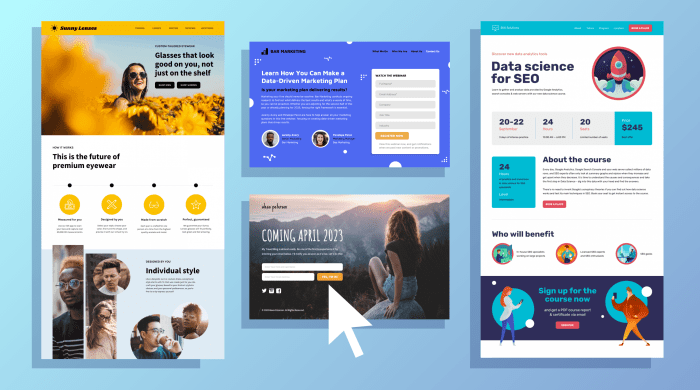
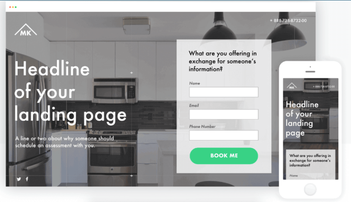
Creating Landing Pages That Convert is crucial for any online business looking to boost their conversion rates. Dive into this guide to discover the secrets behind crafting high-converting landing pages that drive results.
From understanding the fundamentals to designing visually appealing layouts and writing compelling copy, this guide covers it all. Get ready to take your landing pages to the next level!
Understanding Landing Pages

A landing page is a standalone web page specifically designed to capture a visitor’s attention and prompt them to take a specific action, such as signing up for a newsletter, downloading a resource, or making a purchase. The primary purpose of a landing page is to convert visitors into leads or customers by guiding them towards a desired goal.
Creating landing pages that convert is crucial for any online business or marketing campaign. A well-designed landing page can significantly increase conversion rates and ultimately drive more revenue. By optimizing the layout, content, and call-to-action buttons, businesses can maximize the impact of their landing pages and improve overall performance.
Examples of Successful Landing Pages
- 1. Airbnb: Airbnb’s landing pages are clean, visually appealing, and focus on showcasing stunning images of properties to entice users to book. The use of clear and compelling copy, along with a prominent call-to-action button, makes it easy for visitors to take action.
- 2. Slack: Slack’s landing pages are simple and straightforward, highlighting the key features of the product and emphasizing how it can improve communication and productivity. The use of social proof and customer testimonials adds credibility and trust.
- 3. Dropbox: Dropbox’s landing pages are highly effective in demonstrating the value proposition of their service, emphasizing simplicity and ease of use. The use of animated explainer videos and clear pricing information helps visitors understand the benefits and encourages sign-ups.
Designing a High-Converting Landing Page

Creating a landing page that converts requires careful attention to design elements that can influence user behavior and encourage them to take action. From layout to color choices, every detail plays a crucial role in the success of a landing page.
Key Elements of a High-Converting Landing Page
- Clear Call-to-Action (CTA): Your CTA should be prominently displayed and easily noticeable to guide users towards the desired action.
- Minimalist Design: Keep the design clean and clutter-free to avoid distracting users from the main goal of the page.
- Compelling Headline: Use a catchy headline that grabs attention and conveys the value proposition of your offer.
- Engaging Visuals: Incorporate high-quality images or videos that resonate with your target audience and enhance the overall user experience.
- Social Proof: Include testimonials, reviews, or trust badges to build credibility and reassure visitors about your product or service.
Creating a Visually Appealing Layout
A visually appealing layout is essential for keeping users engaged and guiding them towards conversion. To achieve this, focus on:
- Whitespace: Use ample whitespace to create a sense of balance and allow important elements to stand out.
- Hierarchy: Organize content hierarchically to prioritize key information and guide users through the page in a logical sequence.
- Responsive Design: Ensure your landing page is optimized for all devices to provide a seamless user experience across different screen sizes.
Tips for Using Colors, Fonts, and Images Effectively
- Colors: Choose a color scheme that aligns with your brand identity and evokes the desired emotions in your audience. Use contrasting colors for CTAs to make them stand out.
- Fonts: Select easy-to-read fonts that complement your brand style. Maintain consistency in font sizes and styles to enhance readability.
- Images: Use high-quality images that are relevant to your offer and resonate with your target audience. Avoid using stock photos that may appear generic or unauthentic.
Writing Compelling Copy
Crafting persuasive copy is crucial for a landing page as it is the key to capturing the attention of visitors and convincing them to take the desired action. Compelling copywriting helps in building trust, addressing customer pain points, and creating a sense of urgency that drives conversions.
Crafting Engaging Headlines and Compelling Calls-to-Action
When writing headlines, it’s essential to be clear, concise, and impactful. Use power words, make it benefit-driven, and create a sense of curiosity to entice visitors to keep reading. For calls-to-action, focus on creating a sense of urgency, using action-oriented language, and highlighting the value proposition to encourage clicks.
- Use numbers, statistics, or emotional triggers to make your headlines more engaging.
- Personalize the calls-to-action to resonate with the target audience.
- Keep the copy concise and focused on the benefits for the visitor.
Remember, the headline is the first thing visitors see, so make it count!
Creating a Sense of Urgency and Addressing Customer Pain Points
To create a sense of urgency, use phrases like “limited time offer,” “act now,” or “exclusive deal” to motivate visitors to take immediate action. Address customer pain points by highlighting how your product or service can solve their problems and improve their lives. Use testimonials, case studies, and social proof to build credibility and trust.
- Highlight the benefits of acting now rather than later to create a fear of missing out.
- Focus on the emotional impact of not taking action and how your solution can alleviate that pain.
- Show empathy and understanding of your target audience’s struggles to connect on a deeper level.
Optimizing for Conversions: Creating Landing Pages That Convert
When it comes to creating landing pages that convert, optimizing for conversions is key. A successful landing page is not just about design and copywriting; it’s also about analyzing user behavior and making data-driven decisions to improve conversion rates.
Importance of A/B Testing, Creating Landing Pages That Convert
A/B testing is a crucial tool for optimizing landing pages. By testing different versions of your page with slight variations, you can identify what resonates best with your audience and drives more conversions.
- Test different headlines, images, call-to-action buttons, and overall layout to see what combination works best.
- Use A/B testing tools like Google Optimize or Optimizely to track and analyze the results of your tests.
- Make incremental changes based on the data you gather to continuously improve your conversion rates.
Analyzing User Behavior
Understanding how users interact with your landing page is crucial for optimization. By analyzing user behavior, you can make informed decisions on how to improve the user experience and increase conversions.
- Use tools like Google Analytics to track user engagement, bounce rates, and conversion paths.
- Look for patterns in user behavior and identify areas of improvement based on the data collected.
- Implement changes based on user feedback and data analysis to optimize your landing page for better results.
Optimizing Forms and Buttons
Forms and buttons are critical elements of a landing page that can impact conversion rates. Optimizing these elements for usability and clarity can make a significant difference in your conversion rates.
- Keep forms simple and only ask for essential information to reduce friction and increase conversions.
- Use clear and compelling call-to-action buttons that stand out on the page and clearly communicate the desired action.
- Optimize button placement, size, color, and text to encourage clicks and guide users towards conversion.